If you observe, pipelines are now everywhere in the field of data science and machine learning. You can see them ranging from basic data pipelines to complex machine learning workflows. They have gained popularity because of their capabilities of streamlining processes in data analytics and machine learning. This helps to speed up the processes by automating the machine learning workflow and linking the parts together.
Components of an ML Pipeline
A pipeline is an integration of the individual components in a machine learning workflow. These components may vary from pipeline to pipeline, however a typical ML pipeline includes:
Data extraction and validation
Data preprocessing
Feature selection
Model training and evaluation
Re-training trigger
To better illustrate the workflow, the above mentioned components are discussed step-by-step in python, considering the below problem statement.
Problem Statement: Build a basic pipeline that can be used to predict the onset of diabetes based on the given diagnostic measures in the data. The dataset is originally from the National Institute of Diabetes and Digestive and Kidney diseases. Further, all the patients in the given dataset are females who are at least 21 years old.
1) Data extraction and validation
Let’s start by importing the required libraries for our pipeline.
					import numpy as np
import pandas as pd
import matplotlib.pyplot as plt
import seaborn as sns
import plotly.offline as py
import plotly.graph_objs as go
Then, download the Pima Indians diabetes dataset from here and load the csv file in your environment using the following command.
data = pd.read_csv('diabetes.csv')
data_cols = data.columns
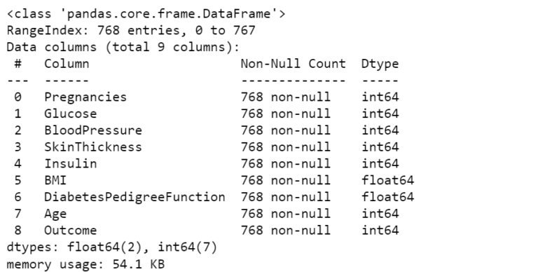
data.info() # Prints the info about loaded data
As we can see from the above information, the data has in total 768 non-null entries. However, if there are any null entries then it is recommended to delete the entire row to maintain the consistency in the data. Secondly, it has 9 columns, out of which 8 are the diagnostic measures and the last one shows the outcome of the diagnosis. Further, to see the values stored in each column we can run the following command.
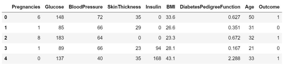
data.head()
The output shows the values for the first 5 entries of our dataset. As we observe, the column ‘Outcome’ outputs 1 for the diabetic patients whereas it outputs 0 for non-diabetic patients.
Additionally, you can always use various available methods in the pandas.Dataframe library to learn more about the data set.
2) Data preprocessing
Data preprocessing is a critical component of the pipeline, as it improves the quality of the input data thereby improving the quality of the predicted output. Generally, it includes steps like handling missing values, removing duplicates, handling outliers, and feature scaling. For conciseness, steps for a) Handling outliers and b) Feature scaling are illustrated below.
a) Handling outliers
Outliers are the points that lie at an abnormal distance from other observations in the sample and may not represent the true data point. They can occur due to the variability in the measurements or any experimental errors. Therefore, it is important to carefully detect and remove such outliers, as they can skew the training results. Thereby, reducing the accuracy of the model.
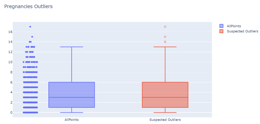
The above function plots two boxplots. The first traces all the points for the given feature. The second traces the boxplots with suspected outliers. These outliers are calculated based on the upper and lower boundaries. That means, any value ( V ) that is 1.5 x IQR (Inter-Quartile Range) greater than the third quartile (Q3) or 1.5 x IQR lesser than the first quartile (Q1) are designated as outliers.
To know more about the available methods in plotly boxplots for detecting outliers, refer here. As an example, outliers boxplots for ‘Pregnancies’ are plotted below.
OutliersBox(data, data_cols[0])
As we observe, there are three suspected outliers in the number of Pregnancies. Intuitively, it is also odd to have 14 to 17 pregnancies for a woman. Furthermore, we need to remove such outliers from each column of our dataset.
					def TukeyOutliers(data, feature_name, drop=False):
    data_array = data[feature_name]
    Q1 = np.percentile(data_array, 25)
    Q3 = np.percentile(data_array, 75)
    step = 1.5*(Q3-Q1)

    outlier_indices = data_array[~((data_array>=Q1-step)&(data_array<=Q3+step))].index.tolist()
    outlier_values = data_array[~((data_array>=Q1-step)&(data_array<=Q3+step))].values

    print ("Number of outliers (inc duplicates): {} and outliers: {}".format(len(outlier_indices), outlier_values))

    if drop:
        good_data = data.drop(data.index[outlier_indices]).reset_index(drop = True)
        print ("New dataset with removed outliers has {} samples with {} features each.".format(*good_data.shape))
        return good_data

    else:
        print ("Nothing happens, df.shape = ",data.shape)
        return data
The above function calculates the boundaries based on the Inter-Quartile Range (IQR) and removes the indices of the data containing the outliers. Then, the function can be used to remove outliers for each column sequentially, as shown below.
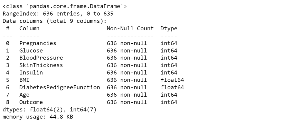
Once the outliers are removed, we can check the entries of the cleaned dataset.
data_clean.info()
The new dataset contains 636 non-null entries. Now we can move to the next step of our data preprocessing called feature scaling. This further improves the accuracy of the trained model.
b) Feature scaling
Many times, the range of the features can vary drastically. In these cases, algorithms tend to become bias towards the features with larger range. Therefore, to avoid such biases, it is required to bring them on a common scale. Further, it also helps machine learning algorithms to train and converge faster.
The two most popular scaling techniques in machine learning are Normalization and Standardization.
Normalization or Min-Max scaling utilizes the minimum and maximum value of the feature to scale the data between 0 and 1.
Normalization can only be used when there are no outliers in the dataset, as it can’t cope up with them.
Standardization or Z-Score Normalization utilizes mean and standard deviation of the feature to scale the data.
Standardization is helpful in cases where data follows Gaussian distribution. Also, it is unaffected by outliers since there is no predefined range in transformed features.
					from sklearn.preprocessing import StandardScaler
from sklearn.preprocessing import MinMaxScaler
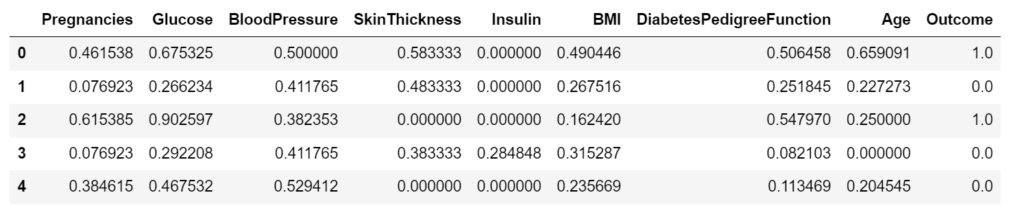
The above code scales the data with both the discussed techniques. Further, results for normalization are shown below. As you can see the data has been scaled in the range [0,1]
data_norm.head()
Once the features are scaled, we can move forward to the next component of our pipeline: Feature selection
3) Feature selection
Feature selection improves the accuracy of the model, by selecting the important features and removing the redundant and irrelevant ones.
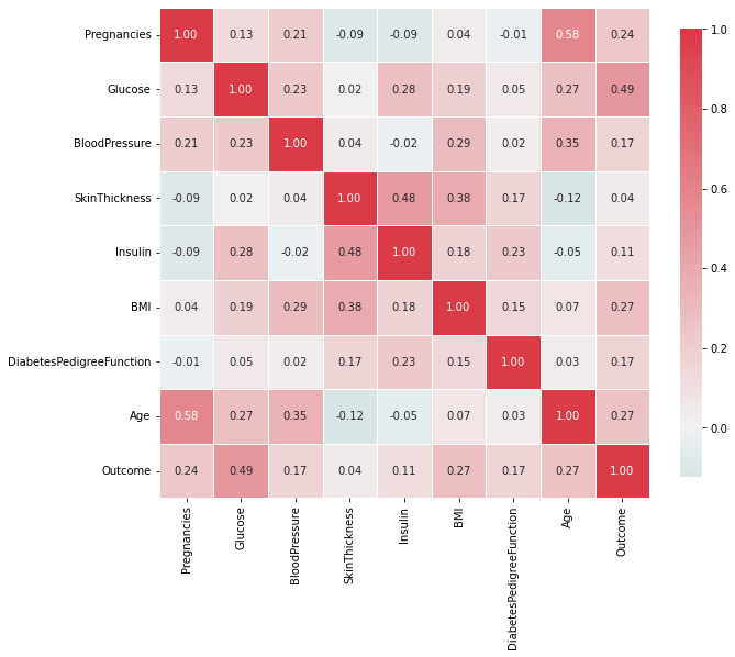
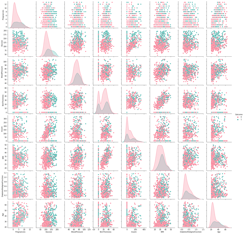
One of the criteria for checking the redundant features is to check for the correlation between the data. If any two features are highly correlated, then using them for training can lead to overfitting of the model. Hence, reducing the accuracy of unseen dataset.
From the above figures, we can observe that there are no highly correlated variables in our dataset. Hence, in our case, we can train the models with all of the given features or variables.
Additionally, there are several other available methods to select important features. These include Chi-square test, Fisher’s score, Variance threshold, etc. To learn more about them refer this article.
4) Model training and validation
After cleaning and pre-processing the data, we can start training our models and compare the results based on different performance metrics. We will take three classifiers for our classification task.
If you are new to classification in machine learning, refer to my blog on brief introduction to classification tasks for beginners.
					from sklearn.linear_model import LogisticRegression
from sklearn.tree import DecisionTreeClassifier
from sklearn.neighbors import KNeighborsClassifier
from sklearn.model_selection import train_test_split
from sklearn.model_selection import cross_val_score
					X = data_norm[data_cols[0:8]]
y = data_norm[data_cols[8]]
X_train, X_test, y_train, y_test = train_test_split(X,y, test_size=0.25,random_state=0,stratify=data_std['Outcome'])
To train the classifiers, cross validation technique is employed. It splits the data into k (k=7 in our case) subsets. Then, for every iteration from 1 to k, each of these subsets are then used as validation set in combination with the complementary dataset as training set (refer this video from StatQuest to learn more about it).
At the end, it calculates the accuracy of the trained model for each iteration. Apart from the accuracy, there are several metrics to evaluate and compare the models. These include confusion matrix, recall, precision, and F-score. To learn more about them you can refer this article.
The mean of the scores for all the splits are shown below.
Based on our results, we observe that Logistic regression model works best among the chosen classifiers for our dataset. However, that’s not the end here. We can always tune the hyper-parameters of our model in order to improve their individual accuracies. For instance, number of neighbours to be used in K-neighbours classifier or the maximum allowed depth of the tree in Decision tree classifiers can affect the accuracies of the respective classifiers.
We will not be discussing the hyperparameter tuning here, as it is out of scope for this post. However, you are always welcome to do the tuning part yourself and mention the highest accuracies that you achieve in the comments section below. I would be happy to know your techniques in improving the accuracies.
5) Re-training trigger
Once the pipeline is completed and deployed in the real-world, it should adapt to the changing data points in future. If it is unable to do so, the model may become obsolete with time. Therefore, the model needs to be retrained periodically on the new dataset.
For many, this retraining condition must be triggered automatically in order to completely automate the workflow in the pipeline. These re-training triggers can be set according to certain conditions. For instance, one might monitor production drift and initiate a re-training run, or set it to run at regular intervals, based on their use-case.
Once the trigger is set, the pipeline can be set to running without any human interventions and can help speed up the processes, thereby improving the efficiency of the workflows.
Conclusion
To wrap up, we have uncovered the components of a typical ML pipeline from data extraction to model evaluation and validation to setting the triggers for retraining.
Remember, a well structured pipeline isn’t just about the automation; it is about creating a dynamic, adaptable framework that evolves with your data and objectives. I would really appreciate you all to start the journey of building your own pipeline from scratch using Python. This will also help you gain a solid understanding of techniques used in machine learning workflows.
At the end, I would like to thank you all for taking the time to read this blog till the end. Hope you learned something valuable today.
Stay curious, stay innovative!!
Share:
2 Responses
Its like you read my mind You appear to know a lot about this like you wrote the book in it or something I think that you could do with some pics to drive the message home a little bit but instead of that this is fantastic blog An excellent read I will certainly be back
Logistic regression is a machine learning model that helps in the classification of the data in pre-defined classes. The classification can be either binary (two-class)
Generative Adversarial Networks (GANs) are popular for their capabilities in generating fake data, including fake images or videos. But what made them so powerful? Read to know more about their architecture and training process.
In machine learning, a pipeline is a sequence of automated data processing and modeling steps that convert raw data into a refined predictive model. Read this blog to get hands-on tutorial on end-to-end development of a pipeline using Python.
ChatGPT is the single fastest growing human application in the whole history. It had around 100 million users in just 2.5 months from its launch date. What exactly is about ChatGPT that made it widely popular?


2 Responses
Its like you read my mind You appear to know a lot about this like you wrote the book in it or something I think that you could do with some pics to drive the message home a little bit but instead of that this is fantastic blog An excellent read I will certainly be back
Thanks for your feedback. Happy to know.